Playoff T-Shirt Power Rankings
The incisive analytical content you all love
Ok, so this second round has been incredible drama (the second round of the playoffs is always the best!). We’ve seen comebacks, controversies, massive performances, huge disappointments, hard fouls (and untimely injuries), beautiful shots, and beef. So much beef.
Three series are tied 2-2, and only the Warriors have a 3-1 lead over the Grizzlies. There’s a lot of interesting basketball to dissect. But first, we have to talk about the playoff T-shirts these teams are wearing.
You’ve seen them, I’m sure, during warm-ups or timeouts. Every time they show an end-of-bench player, he’s wearing a specific T-shirt, usually with the team-specific mantra for this year’s playoff run. Some of these shirts and slogans are good, and some are not. Today, I unveil the official (and, as far as I can tell, only) Playoff T-Shirt Power Rankings, from worst to best.
Some criteria, for the scientists and analysts in the audience:
How nice-looking are the tees?
How catchy is the slogan?
Actually, that’s it. This isn’t complicated.
My wife once told me I have “adequate” fashion sense, so I’m very qualified to pass judgment.
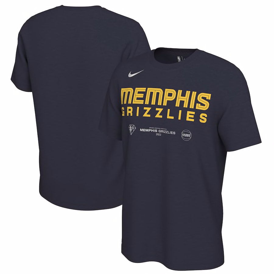
8. #MemTHIS / Memphis Grizzlies
What in the world does “#MemTHIS” mean? Why is it a hashtag?
Upon this slogan’s release, fan outburst was so strong that the team pulled it from their official T-shirts (I’m assuming). These shirts now just say “Memphis Grizzlies,” with no playoff pomp.
I spent an inordinate amount of time trying to decipher the meaning behind this baffling slogan. Nobody knows. Twitter and Reddit are filled with confused fans asking the same questions, wondering why a city filled with rich culture and a fabled basketball scene decided to make up a weird pun(??) using a definite article of unclear origin. The best reasoning that I found online came from @TJfromTWITTER:
It did not, in fact, get the people going.
This is yet another example of a team not doing appropriate market research — who is buying a “#MemTHIS” T-Shirt?
Apparently, no one. It was by far the hardest for me to find a picture of and to find for sale, likely because fan confusion and apathy towards it was immediately apparent. It’s a classic story: a young marketing team unused to playoff success needs to go through some bumps and bruises before they become true contenders.
The shirts themselves, bereft of anything exciting, are bland, with as little thought put into the design as the discarded slogan.
“#MemTHIS” sucks even more knowing that Memphis has some of the best slogans in basketball. “Grit ‘N’ Grind” is a Memphis classic, encapsulating the town's spirit and the mid-2010s blue-collar teams. “We Don’t Bluff” may be a little problematic when you think about what it’s implying, but it’s undeniably awesome. “#MemTHIS” isn’t in the same universe, and the Grizzlies were left scrambling to create an alternate.
Unfortunately, they couldn’t come up with anything and released a generic “Memphis Grizzlies” tee. What a way to celebrate perhaps the team’s most exciting season ever.
7. Celtic Pride
It’s fine. The Celtics are one of the two premier clubs in the NBA, and they are tied with the Lakers for most championships with 17 banners (even if they only have one in the last 35 years). They are also one of the favorites to win the championship this season (if, uh, they can get past a Milwaukee team missing an All-Star). Boston fans have plenty to be proud of.
The shirts are okay. The Celtics’ colors are perhaps the best in the league, and their iconography is classic (if objectively silly). This is a very safe and somewhat boring shirt/slogan combination, but at least there isn’t mystifying wordplay or a hashtag. Apparently, that’s all it takes to stay out of the basement in the T-Shirt Power Rankings.
6. White Hot Playoffs
The Heat have been doing stadium white-outs since 2006, after black and then red playoff campaigns the two years prior, and that 2006 campaign resulted in the Heat’s first championship. They’ve since been a Miami playoff staple, so White Hot has a lot of history.
The Heat claimed to be the first NBA team to do an all-color theme back in the early D-Wade days, which adds more legitimacy to their ongoing tradition. Also, I don’t care what anyone says. The white-out looks freaking sweet:
“White Hot” obviously plays nicely with the Heat team name. It’s not a particularly inspiring playoff slogan, but it does the job. The shirts, sadly, are boring. They don’t have any fun visual imagery outside of a tiny Heat logo, and the oval clutters the shirt without adding anything. I also find the weird camel case in the words distracting… maybe it’s supposed to be reminiscent of the Heat’s ransom-letter Vice jerseys?
5. Dallas In
The shirts are a beautiful color and contain a visual trick - you can see it’s supposed to say “All In,” a perfectly reasonable slogan. I’ve always been partial to the Mavericks’ logo.
I dock points from these shirts because the actual phrase, “Dallas In,” is kind of stupid. Is Dallas in… trouble? Love? Texas? I don’t like the ambiguity. But I do like the shirts.
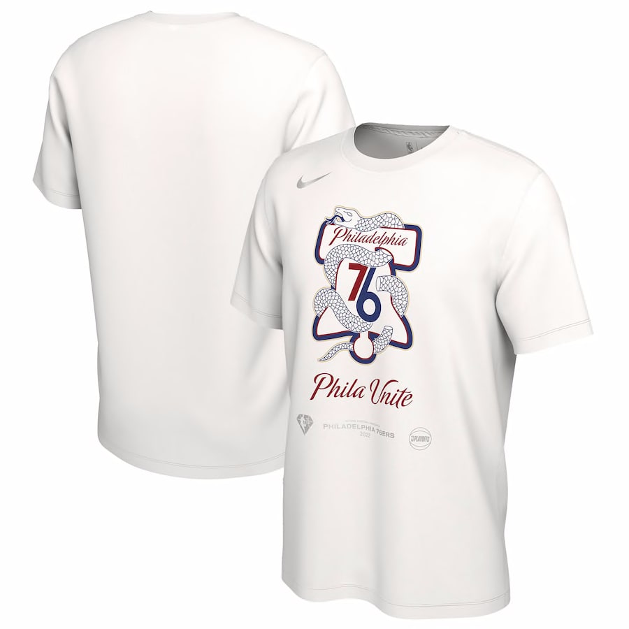
4. Phila Unite
These shirts are eye-catching, with their Ben Franklin-inspired “Join or Die” background. They feel genuinely unique to the city even if the design is busy. The segmented snake is a little bit horrifying, but I appreciate the attention to detail.
One question: Do Philadelphians actually say “Phila” instead of “Philly?” It looks like it should be pronounced “Fyla.” The more I talk about this, the less I like it.
Philadelphia as a city has been relatively united behind this Sixers team, however — first in their hatred for Ben Simmons, then in their unwavering support for Joel Embiid’s MVP candidacy. So at least the shirt rings true.
3. Rally the Valley
Miraculously, our first rhyme! It seems impossible, but out of the eight remaining playoff teams, only two have rhymes as their playoff mantra.
“Rally The Valley” is a strong slogan with a real call to action. The Valley references Phoenix’s locale, known as The Valley of the Sun. It all comes back full circle.
The shirts themselves are clean and straightforward. The font brings excellent energy, making up for the lack of a more prominent visual element. The Sun is noticeable but tastefully small. I’m a little surprised they went with a black tee, but at least it would match anything.
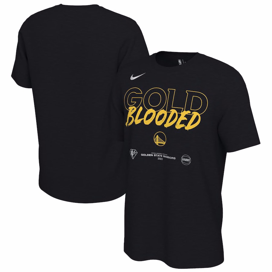
2. Gold Blooded
Our top two shirts are light-years beyond the competition.
Gold is a primary Warriors color. They’re a team filled with cold-blooded assassins, like Steph Curry and Jordan Poole. Heck, the average Warriors fan in the new Chase Center stadium has to pay for tickets with actual gold bars, so it works on every level.
The mantra even works for wearing it to pick-up games. It reminds me of the old And1 t-shirts we used to wear in elementary school, filled with sick disses like “Hope you brought lotion, because you’re about to get burned.”
The fonts are perfect for the phrase. Black as the base color makes sense here since it lets the gold lettering pop. Seeing guys like Andre Iguodala and Nemanja Bjelica wearing these beauties on the sidelines inspired me to make this post.
1. Fear The Deer
What a gorgeous shirt!
“Fear The Deer” is an underrated mantra. After all, deer are the deadliest animals in North America. You should be afraid.
The Bucks are the defending champions, and Giannis Antetokounmpo is indisputably the most fearsome player on the planet. The slogan rings differently these days.
I love the Buck as a logo. He’s about as menacing as a deer could be. Like all great logos, the Buck has several little hidden features (the inner antlers evoke a basketball, and the neck hides a stylized “M” for Milwaukee). Forest green is a fitting color for a woodland creature, and it’s neutral enough I could wear it with pretty much anything.
These are the pinnacle of playoff tees, and I’m sure they’ll be around in some fashion or another for years to come.
We’ll be back on Friday with actual basketball analysis, I promise.


